
Matheus Breda Ferreira
2023

POR. BR
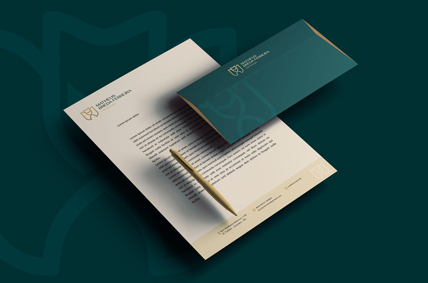
A inspiração principal para a criação da identidade visual foi através do conhecimento empírico e depois estudado, de acordo com conversas e reunião com o cliente para entender os principais procedimentos que serão trabalhados pelo profissional, no caso desenvolvimento de laminados cerâmicos, ou as conhecidas lentes de contato dentais, tratamentos clínicos e consultoria odontológica digital.
Com essas informações coletadas, buscamos trabalhar com a ideia de sobreposição, pois a lente se sobrepõe ao dente na composição do novo sorriso.
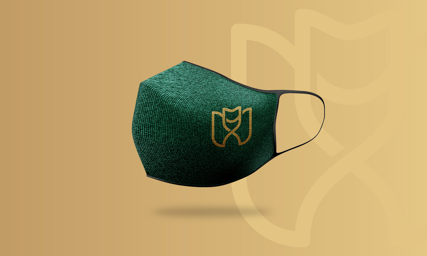
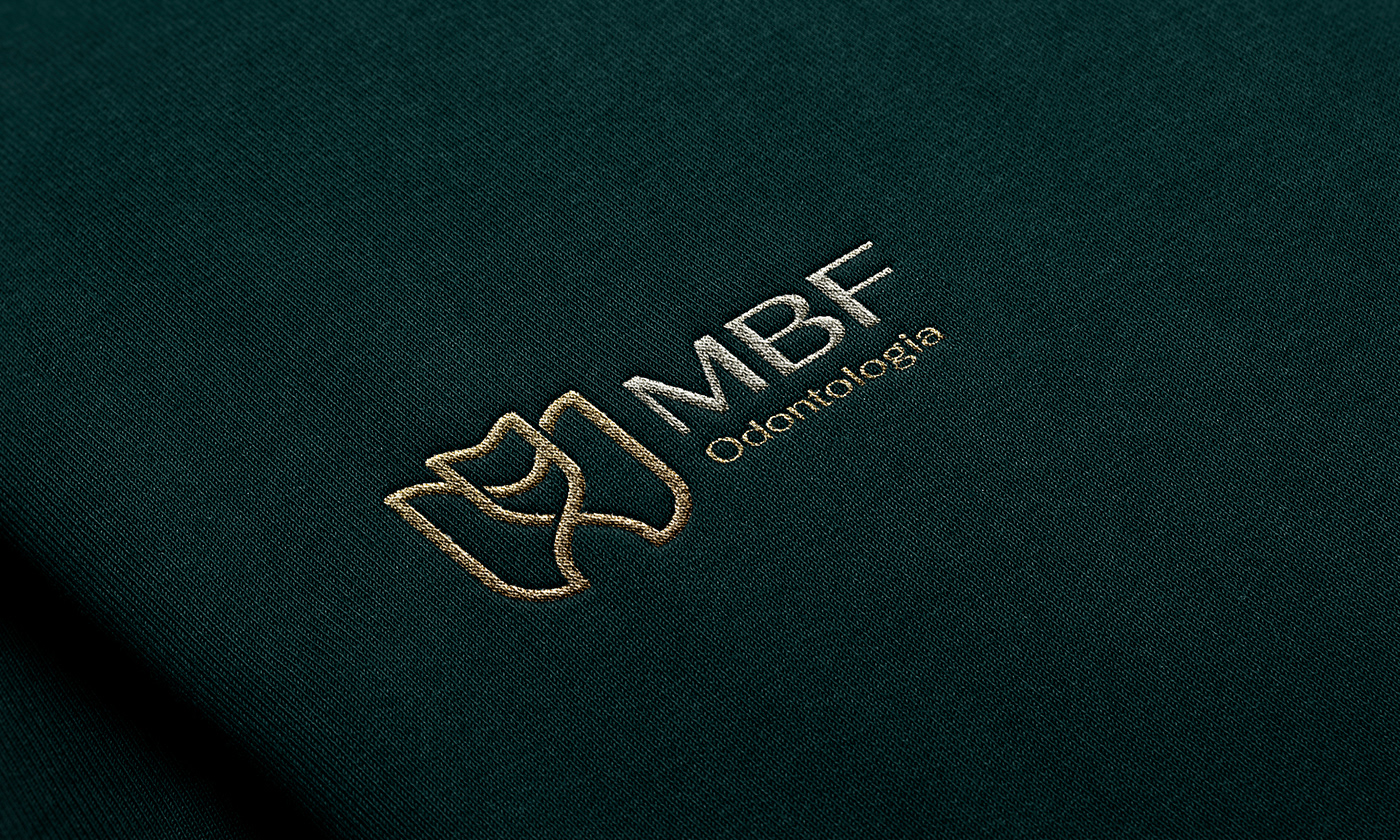
Com isso procuramos trabalhar com traços retos e curvos em simetria, criar um símbolo com uma representatividade subjetiva, com a junção de um DENTE + LETRA M + LETRA X sobrepostos.
Criamos o símbolo com a união desses elementos, onde surgiu um elemento único e exclusivo. A letra X apareceu conveniente no desenho do símbolo, para representar subjetivamente a multiplicação e prosperidade.
As cores, foram escolhidas por trazerem sofisticação e requinte, adjetivos buscados através do DNA e posicionamento da marca.
ENG. US
The main inspiration for the creation of the visual identity was through empirical knowledge and then studied, according to conversations and meeting with the client to understand the main procedures that will be worked on by the professional, in this case the development of ceramic laminates, or the well-known glass lenses. dental contact, clinical treatments and digital dental consulting.
With this information collected, we tried to work with the idea of overlapping, as the lens overlaps the tooth in the composition of the new smile.
With that, we tried to work with straight and curved lines in symmetry, to create a symbol with a subjective representation, with the combination of a superimposed TOOTH + LETTER M + LETTER X.
We created the symbol with the union of these elements, where a unique and exclusive element emerged. The letter X appeared conveniently in the design of the symbol, to subjectively represent multiplication and prosperity.
The colors were chosen because they bring sophistication and refinement, adjectives sought through the brand's DNA and positioning.


Muito Obrigado!
Thanks!


